Ya, see that, itès a cooling Jupiter
Shrink Spot, Shrink
Posted on November 27, 2014 by Stephen Smith
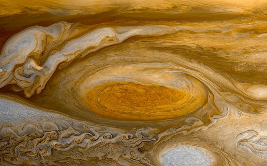
 Jupiter’s Great Red Spot from the New Horizons spacecraft in transit to Pluto. Credit: NASA/JPL
Nov 27, 2014
The size of Jupiter’s red vortex is smaller than ever.
For over 300 years, the Great Red Spot has persisted in Jupiter’s atmosphere—longer than telescopes have existed to see it. It is commonly believed to be a cyclonic storm driven by thermal convection from deep inside Jupiter’s atmosphere. How it was formed and why it has lasted so long remain a mystery, however.
No one is sure why it is red in color. In fact, scientists are not sure why any of the gas giant planets possess unique color schemes. Neptune has a blue tint, Uranus green, Saturn is pale yellow, and Jupiter is a rusty red, overall.
According to a recent press release, the Spot is shrinking. It is now measured to be 16,650 kilometers long, the smallest yet. Measurements over the years indicate that it varies in size. At one point, it was over 39,000 kilometers long and 21,000 kilometers wide.
Conventional investigators contend that the warmer areas in the center of the Spot’s vortex are sufficient to drive its rotation as well as to turn that center a darker red than the rest of the Spot. The red color’s origin—whether from chemical changes in the atmosphere or upwelling of other materials from below—requires further study. Harvard University fluid dynamics researcher; Pedram Hassanzadeh, believes that it is “vertical flow” that maintains the Great Red Spot. Thinking that the red vortex is a storm means that vertical flows circulate hot and cold gas in and out of it, thus preventing it from dissipating.
From an Electric Universe perspective, the Great Red Spot could have a different origin altogether: Jupiter’s turbulent atmosphere might be receiving its energy from an external source.
Shrink Spot, Shrink
Posted on November 27, 2014 by Stephen Smith
 Jupiter’s Great Red Spot from the New Horizons spacecraft in transit to Pluto. Credit: NASA/JPL
Nov 27, 2014
The size of Jupiter’s red vortex is smaller than ever.
For over 300 years, the Great Red Spot has persisted in Jupiter’s atmosphere—longer than telescopes have existed to see it. It is commonly believed to be a cyclonic storm driven by thermal convection from deep inside Jupiter’s atmosphere. How it was formed and why it has lasted so long remain a mystery, however.
No one is sure why it is red in color. In fact, scientists are not sure why any of the gas giant planets possess unique color schemes. Neptune has a blue tint, Uranus green, Saturn is pale yellow, and Jupiter is a rusty red, overall.
According to a recent press release, the Spot is shrinking. It is now measured to be 16,650 kilometers long, the smallest yet. Measurements over the years indicate that it varies in size. At one point, it was over 39,000 kilometers long and 21,000 kilometers wide.
Conventional investigators contend that the warmer areas in the center of the Spot’s vortex are sufficient to drive its rotation as well as to turn that center a darker red than the rest of the Spot. The red color’s origin—whether from chemical changes in the atmosphere or upwelling of other materials from below—requires further study. Harvard University fluid dynamics researcher; Pedram Hassanzadeh, believes that it is “vertical flow” that maintains the Great Red Spot. Thinking that the red vortex is a storm means that vertical flows circulate hot and cold gas in and out of it, thus preventing it from dissipating.
From an Electric Universe perspective, the Great Red Spot could have a different origin altogether: Jupiter’s turbulent atmosphere might be receiving its energy from an external source.
 Steve Goddard @SteveSGoddard


