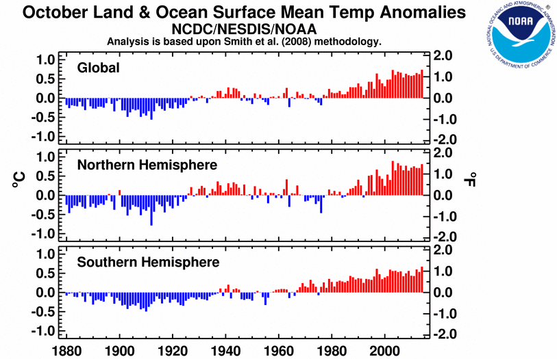
Goody another graph. Must be right.
as before, as always... you're most encouraged to bring forward countering presentation that would dispute the, as you say, "rightness" of the graph above... of any graph I present. You've sure whined and wailed over a number of graphs I've linked to recently; but somehow, you never can get past your chirping state and actually challenge them. Wonder why, hey? I mean if you're so doubting the veracity of graphed presentations I'm posting, what are waiting for? Why aren't you countering them? Is there a problem for you?

Modeled could bes? Which model? None work so this graph is a wash.
Right on.
ignore the dashed red-line projection! The point was your 2 failed graphs don't include the most recent warming... the instrumental record measure (as represented by the solid red-line in the graph I presented, as above).
as for the model projection you hoped to distract on, that's quite the liberty you're taking in outright dismissing a futures projection. In any case, per that graph, the model projection is shown as high-level as could be. That dashed line actually represents CMIP3 models and depending on what related emissions scenario is chosen, the placement on that projection line will change.
but let me ask the same questions again... I believe this will make it the fifth time I've asked these questions of you. Will you answer this time - finally? Or will you simply distract away to avoid these most difficult questions for you?
you really want to say something about the 'Holocene optimum'... why not just say it? Why are you such a tease? :lol: By the by, what was the cause(s) of warming during that period... and how does that apply in relation to today's relatively recent warming?
