New Study Is A ‘Death Blow’ To Global Warming Hysteria
- Thread starter Locutus
- Start date
You are using an out of date browser. It may not display this or other websites correctly.
You should upgrade or use an alternative browser.
You should upgrade or use an alternative browser.
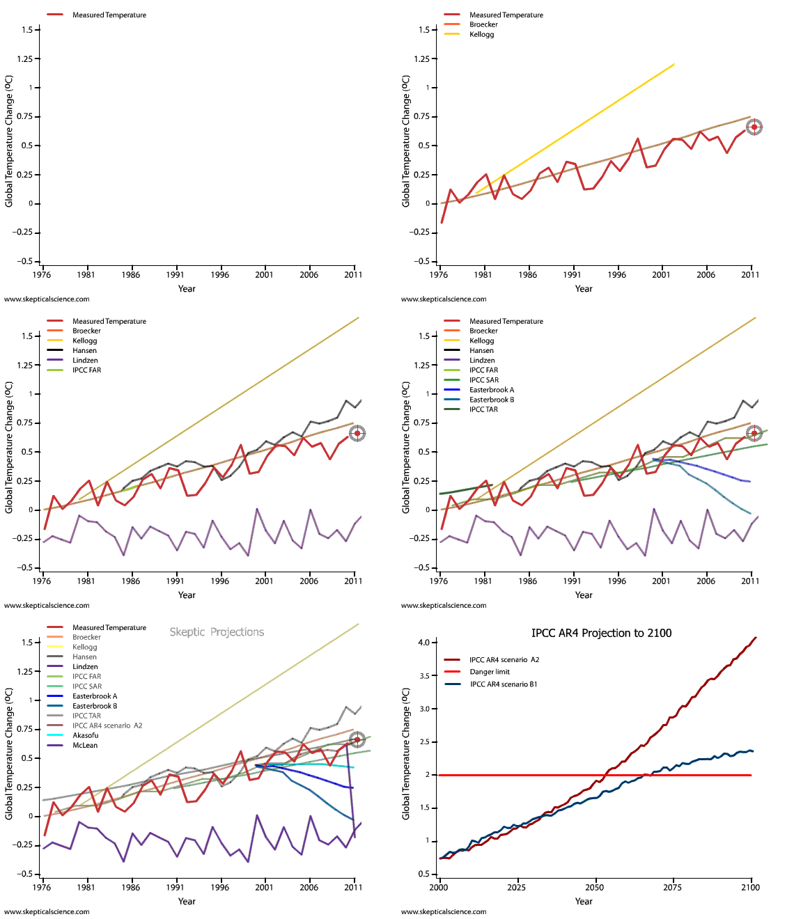
Hey look!... A graph!!
And clearly the graph shows that the changing climate is manmade.
Hey look!... A graph!!
Fairly simple one though. Even you could get this one. :lol: Not too difficult to see the warming trend there. This graph is the reason, more than any, that the deniers are having trouble convincing people that it's not warming.
Fairly simple one though. Even you could get this one. :lol: Not too difficult to see the warming trend there. This graph is the reason, more than any, that the deniers are having trouble convincing people that it's not warming.
... And it's so pretty.
I like red
None of these data were adjusted unless they needed to be to fit the agenda.And it's still getting warmer even after 5 pages of arguing about it. And now the graph the deniers hate.
Another unadjusted data graph.
And it's still getting warmer even after 5 pages of arguing about it. And now the graph the deniers hate.
Go backwards 800 years.
Actually they were adjusted.
Come on feminem, do a rap for us.
Those lying scientists!!!
There you are. You've got one thing right today!
There you are. You've got one thing right today!
Yes, because all scientists are liars.

And it's still getting warmer even after 5 pages of arguing about it. And now the graph the deniers hate.
And, assuming your graph is correct, the temperature has risen by 3/4 a degree Celcius in 130 years, and then dropped a bit.
YAWN.
And, assuming your graph is correct, the temperature has risen by 3/4 a degree Celcius in 130 years, and then dropped a bit.
YAWN.
Nice increments eh?
And that is after adjustments upwards because they can't seem to get the climate to behave.
