Arctic ice refuses to melt as ordered
By Steven Goddard UK Register
Published Friday 15th August 2008 10:02 GMT - source story is here
Just a few weeks ago, predictions of Arctic ice collapse were buzzing all over the internet. Some scientists were predicting that the “North Pole may be ice-free for first time this summer”. Others predicted that the entire “polar ice cap would disappear this summer”.
The Arctic melt season is nearly done for this year. The sun is now very low above the horizon and will set for the winter at the North Pole in five weeks. And none of these dire predictions have come to pass. Yet there is, however, something odd going on with the ice data.
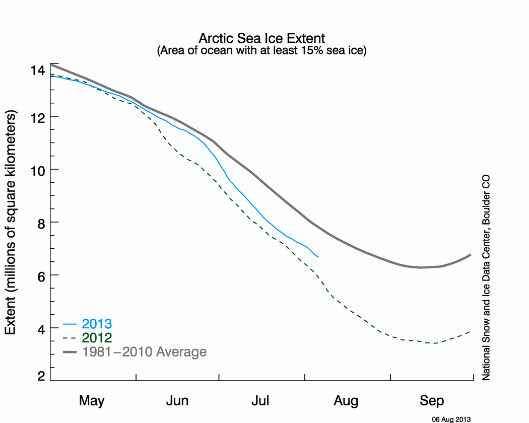
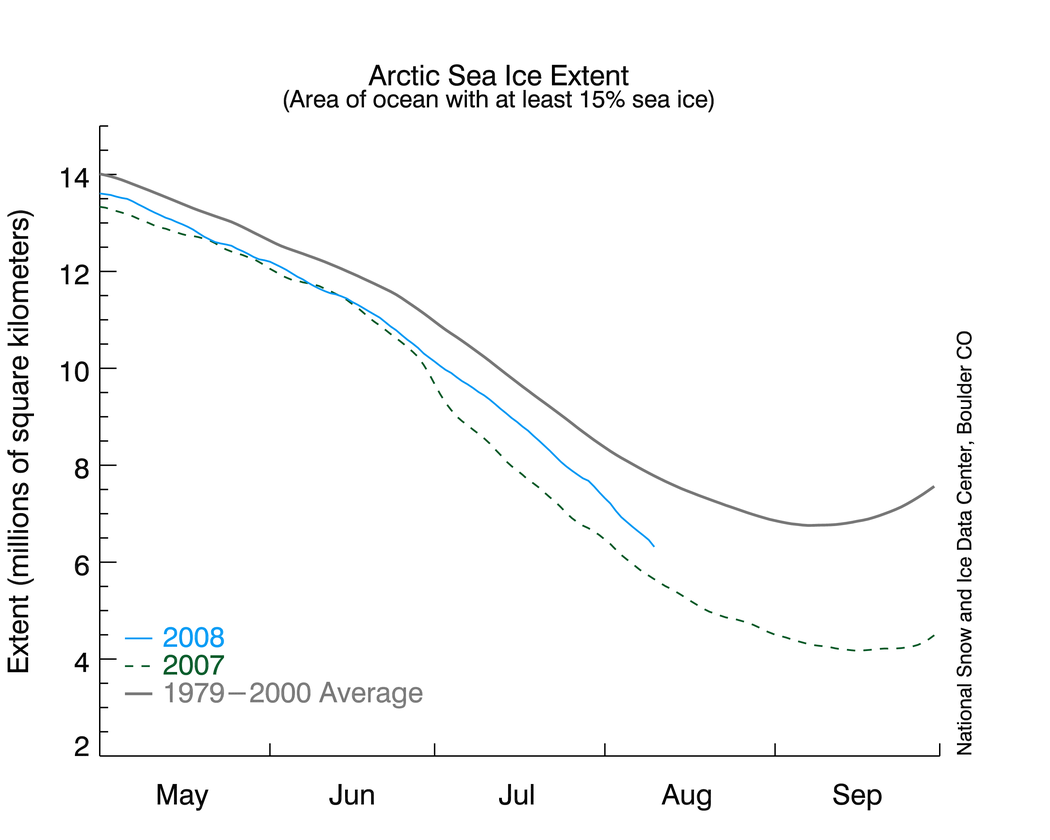
The National Snow and Ice Data Center (NSIDC) in Boulder, Colorado released an alarming graph on August 11, showing that Arctic ice was rapidly disappearing, back towards last year’s record minimum. Their data shows Arctic sea ice extent only 10 per cent greater than this date in 2007, and the second lowest on record. Here’s a smaller version of the graph:
The National Snow and Ice Data Center (NSIDC)’s troublesome ice graph
The problem is that this graph does not appear to be correct. Other data sources show Arctic ice having made a nice recovery this summer. NASA Marshall Space Flight Center data shows 2008 ice nearly identical to 2002, 2005 and 2006. Maps of Arctic ice extent are readily available from several sources, including the University of Illinois, which keeps a daily archive for the last 30 years. A comparison of these maps (derived from NSIDC data) below shows that Arctic ice extent was 30 per cent greater on August 11, 2008 than it was on the August 12, 2007. (2008 is a leap year, so the dates are offset by one.)
Ice at the Arctic: 2007 and 2008 snapshots
As you can see, ice has grown in nearly every direction since last summer - with a large increase in the area north of Siberia. Also note that the area around the Northwest Passage (west of Greenland) has seen a significant increase in ice. Some of the islands in the Canadian Archipelago are surrounded by more ice than they were during the summer of 1980.
The 30 per cent increase was calculated by counting pixels which contain colors representing ice. This is a conservative calculation, because of the map projection used. As the ice expands away from the pole, each new pixel represents a larger area - so the net effect is that the calculated 30 per cent increase is actually on the low side.
So how did NSIDC calculate a 10 per cent increase over 2007? Their graph appears to disagree with the maps by a factor of three (10 per cent vs. 30 per cent) - hardly a trivial discrepancy.
What melts the Arctic?
The Arctic did not experience the meltdowns forecast by NSIDC and the Norwegian Polar Year Secretariat. It didn’t even come close. Additionally, some current graphs and press releases from NSIDC seem less than conservative. There appears to be a consistent pattern of overstatement related to Arctic ice loss.
We know that Arctic summer ice extent is largely determined by variable oceanic and atmospheric currents such as the Arctic Oscillation. NASA claimed last summer that “not all the large changes seen in Arctic climate in recent years are a result of long-term trends associated with global warming”. The media tendency to knee-jerkingly blame everything on “global warming” makes for an easy story - but it is not based on solid science. ®
Bootnote
And what of the Antarctic? Down south, ice extent is well ahead of the recent average. Why isn’t NSIDC making similarly high-profile press releases about the increase in Antarctic ice over the last 30 years?
The author, Steven Goddard, is not affiliated directly or indirectly with any energy industry, nor does he have any current affiliation with any university.
Arctic Ice melt media misinformation retracted
25 Aug 08
The Register reporter Steve Goddard is admitting today that his article last week on melting Arctic Sea Ice (Arctic ice refuses to melt as ordered) is incorrect.
Too bad the damage has already been done.
In his article, Goddard claimed that National Snow and Ice Data Center plot of Arctic Sea Ice Extentwas wrong and that,
"The Arctic did not experience the meltdowns forecast by NSIDC and the Norwegian Polar Year Secretariat. It didn't even come close. Additionally, some current graphs and press releases from NSIDC seem less than conservative. There appears to be a consistent pattern of overstatement related to Arctic ice loss."
Today, Goddard is retracting the claim:
"... it is clear that the NSIDC graph is correct, and that 2008 Arctic ice is barely 10% above last year - just as NSIDC had stated."
But as Joe Romm at ClimateProgress points out it may be too little too late. Goddard's article has already caught fire in the climate denier-sphere with over 70 references to the story according to blog search engine Technorati, with titles like:
- Arctic Ice Grows 30 Per Cent In a Year
- The Global Warming Theory takes a hit
- Fishy Data From the Government
- Here’s another installment about the silliness of “global warming” as posited by politicians and “environmentalists”.
- Cooking the Books to Cook the Ice
- Global Warming is about global government and depopulation
http://www.desmogblog.com/arctic-ice-melt-media-misinformation-retracted
:roll:
Oh and btw, quite a difference a week makes eh Walt old boy....looky below.

Compare it now with your wittle chart....

Run along now......
Last edited: