A new look with improvements

Andem
Avatar
#1
Introducing Canadian Content's new look


It's been in the works for a while and all suggestions have been taken into consideration, incorporated into the new look or in the process of being added. We'd like to welcome regular members to try it all out and tell us what you think!

I'd like to go into a few brief details about the beta which I'll try to give some tips on.

Page Width


The last time we redesigned, some members with various screen resolutions had issues with side scroll. While going back to 640x480 is not really an option, 800x600 is. The three settings available are screen strech, 940px (default) and 800px. You require javascript enabled for the moment to use this feature.

Quick Links


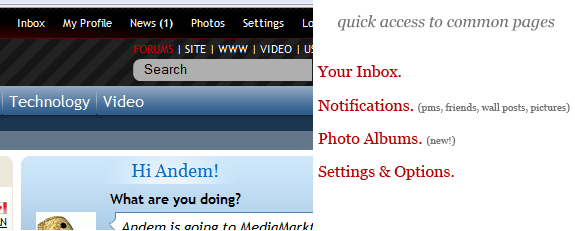
The links at the top of the page are handy and convenient. Joining the top-of-the-screen links list are notifications, a link to a new feature, photo albums and a settings tab with links to your control panel, your account preferences and some profile editing links. For now, there's also the very important quick link to go back to the "live" version of Canadian Content which should bring you back to the 'old look'.

Facebook style status


Expanding the social aspect of this site, it's nice to know what people are upto or what they're currently thinking about.

Photo Albums


A feature we haven't had around here for far too long. It's certainly a work in progress and especially during the beta phase, there's a lot missing. Feel free to upload some pics! They will be linked to your profile.

User Profiles
The profiles have definately been cleaned up and now feel more like a user profile as opposed to a stark white layout with some wall posts like what we have now. These will be added onto during the beta phase! A new feature you might notice on your profile is you're able to see the last 15 visitors to your page and how popular it actually is by seeing how many visitors you've had in total.
Inline editing: You can now edit your profile directly within the page without refreshing, navigating around or wasting any time. Click the "About Me" tab within your own profile and click the pencil icon to edit.

Friends: The friend area has really been cleaned up. A cool new feature is the mutual friends box.

There's a bunch more I could say about improvements and additions, but take a look around and see for yourself. It's a work in progress and I'd like to stress that some pages and modules are not very pretty. Some pages are also broken and don't render properly in most browsers. Another bug I'm aware of is in Internet Explorer: On thread listing pages, the first thread's latest post is squished into the second thread listing. I haven't decided whether I should redesign the feature or if there's a fix I can come up with for IE.


Feel free to use the new layout to browse, post, rate, upload, share, etc! Please give any feedback or thoughts in this thread!


*note: Member username colours are not exactly great looking with the new style. Since it's not a template-related change, they may look ugly in the new layout. It's going to be improved
Last edited by Andem; Nov 24th, 2008 at 01:40 PM..
 
Kreskin
Avatar
#2
Looks good. One thing I notice is the wall post notifications don't appear. Last time I looked I had to go to the old version to check the wall. Is that still the same?
 
Andem
Avatar
#3
Quote: Originally Posted by KreskinView Post

Looks good. One thing I notice is the wall post notifications don't appear. Last time I looked I had to go to the old version to check the wall. Is that still the same?

New wall posts will show in the notifications popup at the top of the page. IE. News (1)
 
Kreskin
#4
It's awesome Andem. Well done.
 
scratch
#5
i like it as well.
scratch
 
Zan
Avatar
#6
Well done Chris - I know you're still working and tweaking, but the ton of work you've already put into it looks great.
 
Hazmart
#7
Hey! It looks great in here! Great Job!
 
Praxius
Avatar
#8
Pretty interesting. I can't think of anything I can say that requires improvement or changes due to conflicts/errors on my end (And I can be picky) so it all looks good on my end..... and I am viewing through Internet Explorer on XP..... I'll let you know how Vista's IE handles it.

And while I'm at it, I'll let you know how the Nintendo Wii's Internet Browser (Opera) can handle it

Added:

Wait, there's one small little problem..... the Quick Reply has the post button on one side (Right) and the advance on the other (Left), but everywhere else they are switched around which threw me off a bit when I went into Advanced when I wanted to just post.... I just gotta pay attention more now I guess, as I'm used to the post button being to the left at all times (as I remember anyways)

Also, I noticed I have to click the Edit button twice in order for it to work. The first time I click it pops the buttons back to where they seem they should be and the second time let's me actually get to the next page.
 
karrie
#9
I love it Andem. Good job.
 
Andem
Avatar
#10
Quote: Originally Posted by PraxiusView Post

Wait, there's one small little problem..... the Quick Reply has the post button on one side (Right) and the advance on the other (Left), but everywhere else they are switched around which threw me off a bit when I went into Advanced when I wanted to just post.... I just gotta pay attention more now I guess, as I'm used to the post button being to the left at all times (as I remember anyways)

Fixed the buttons being mixed up.

Quote:

Also, I noticed I have to click the Edit button twice in order for it to work. The first time I click it pops the buttons back to where they seem they should be and the second time let's me actually get to the next page.

The code for editing a post has not changed and it's standard ajax from the software. You mean editing posts, right?
 
lone wolf
Avatar
#11
Some usernames without avatar - especially in black or blue - tend to vanish into the background. Other than that looks good! Thanks for the screen size option!
 
#juan
Avatar
#12
Yeah I like it too. I never seem to use the quick reply for some reason. Like most people here I probably use either the post reply button or the quote button.

One thing though. Will we always have to log in with our username and password? Is it in the plans for the system to remember us by our IP address or something?
 
DurkaDurka
Avatar
#13
Quote: Originally Posted by #juanView Post


One thing though. Will we always have to log in with our username and password? Is it in the plans for the system to remember us by our IP address or something?

Most ISP's use DHCP to assign IP's meaning that IP could technically be assigned to anyone on the ISP's network, not a great way to authenticate someone.
 
Andem
Avatar
#14
Quote: Originally Posted by #juanView Post

Yeah I like it too. I never seem to use the quick reply for some reason. Like most people here I probably use either the post reply button or the quote button.

One thing though. Will we always have to log in with our username and password? Is it in the plans for the system to remember us by our IP address or something?

No, that would be a gaping security hole if you were to be logged in by IP address. By default, you should automatically be logged in by cookie (this is set up by the check box beside the login info).
 
Praxius
Avatar
#15
Damit, where's the Quote button?..... gotta do this manually I guess:

Quote:

The code for editing a post has not changed and it's standard ajax from the software. You mean editing posts, right?

I ment the top right section of my post where it says "Edit" ~ It does work, however I have to click it twice to get me to the edit page of my post, as the only thing I see occur when I click it the first time is that the circular timer thing revolves once and then it moves that line of links out from the tan area to above it..... might be an IE thing.

Added.... ok, the links are no longer in the tan area, but the first click still shifts the line of links and still have to click it twice, as opposed to just once in the old layout. I am using the lastest and most updated Internet Explorer..... Added again.... ok it's all back in the tan section again.
Last edited by Praxius; Nov 24th, 2008 at 03:40 PM..
 
Praxius
#16
Juan Said:
Quote:

One thing though. Will we always have to log in with our username and password? Is it in the plans for the system to remember us by our IP address or something?

I haven't been logged out yet.
 
Nuggler
#17
 
karrie
Avatar
#18
One suggestion while you're tweaking away....

The CBC feed that pops up on the main page on occasion asks some interesting questions. For the most part it seems to be a consumer research program though. It would be nice to see, as a balance for it's sometimes drivelish questions, the CTV bot brought back to the main page as well. Right now in order to read its articles, you have to go to that specific forum and as such, they don't generate a lot of convo. despite being the more serious news articles.
 
hermanntrude
#19
awesome! they just banned facebook at work so now i can use CCbook
 
Kreskin
#20
Quote: Originally Posted by AndemView Post

New wall posts will show in the notifications popup at the top of the page. IE. News (1)

Hey you got the whole wall thing integrated. This is great.
 
darkbeaver
#21
It's comfortable feeling, if you know what I mean, easy on the eyes
 
In Between Man
Avatar
#22
I really love this! Great job Andem!

I really like the screen size option.

I really like the additional stat on who's super cool enuff to visit my profile page! That's tite.

And it is definitely easier on the eyes.
 
Vereya
Avatar
#23
This is great, Andem!
A great layout, fantastic new features, I love it!
Thanks!
 
Socrates the Greek
#24
Nice work keep it up...........
 
scratch
#25
It's working just fine for me!
regards,
scratch
 
hermanntrude
#26
i spotted a bug, andem:
Attached Images
untitled.JPG (23.0 KB, 8 views)
 
Nuggler
Avatar
#27
Quote: Originally Posted by NugglerView Post


Well, as well: Nice, but it's going to take some getting used to.

Old farts new tricks and all that.

Pretty colours though.
 
Andem
#28
Quote: Originally Posted by hermanntrudeView Post

i spotted a bug, andem:

Fixed.
 
Ron in Regina
Avatar
#29
Andem, the site is very cool, and much like Nuggler say's, "It'll take some getting used to."
In a week it'll all be very familiar. Good Job!

One small thing to mention though....now when someone posts a link in a Thread, the link
shows up in gray, and is pretty easy to miss (might be just me). Is there a way to make a
link show up as a more noticeable color like blue maybe? That would make it easier to spot.

If not, no big thing and in a week I might not even notice the difference. I do now though...
 
Andem
Avatar
#30
Quote: Originally Posted by Ron in ReginaView Post

Andem, the site is very cool, and much like Nuggler say's, "It'll take some getting used to."
In a week it'll all be very familiar. Good Job!

One small thing to mention though....now when someone posts a link in a Thread, the link
shows up in gray, and is pretty easy to miss (might be just me). Is there a way to make a
link show up as a more noticeable color like blue maybe? That would make it easier to spot.

If not, no big thing and in a week I might not even notice the difference. I do now though...

Done! You may have to clear your cache for the updated style to take effect. Links in posts are now blue.
 
no new posts