You can see them through the bars?There's a Mac's, a 7-11 and the Quiki-mart.
Our cooling world
- Thread starter Walter
- Start date
You are using an out of date browser. It may not display this or other websites correctly.
You should upgrade or use an alternative browser.
You should upgrade or use an alternative browser.
I wouldn't have thought of that but if that's what it's actually like ...You can see them through the bars?
What happened to perpetual drought?NOAA: 12-month precipitation record hits all-time high for the third month in a row, U.S.
July 09, 2019
Worst storm of the year hits Croatia, widespread damage reported
July 08, 2019

Massive floods hit Tafalla, Spain
July 08, 2019
Extremely heavy rainfall floods Washington, D.C., nearly a month's worth of rain in 1 hour
July 08, 2019
Climate Change Pseudoscience
Posted on June 28, 2019 by Louis Hissink
An incontrovertible fact is the existence of atmospheric downwelling infrared radiation that is interpreted to come from CO2. Much intellectual gymnastics are used to use this fact as a feature of the Greenhouse Effect of our atmosphere. It is based on the belief that infrared radiation that is absorbed by CO2 is remitted as downwelling infrared radiation causing warming.
Wrong.
The observed atmospheric downwelling infrared radiation is caused by the flow of electric currents through the atmosphere. (The atmosphere is defined as the physical object between the Earth’s surface and the base of the Ionosphere). That IR radiation does not come from CO2.

In other words there is no greenhouse effect since molecules of gas are not thermal batteries. The image was copied from an excellent presentation by Ben Davidson at the 2019 Observing The Frontiers Conference in Albuquerque, New Mexico.
And the fatal flaw in climate science? By restricting the energy input to the Earth as the total solar irradiation, TSI, and assigning the rest of the electromagnetic spectrum to the human contribution to climate change.
All the carbon taxes are working.What happened to perpetual drought?
Progs just use climate change as an excuse to take more liberty from us.Climate Change Pseudoscience
Posted on June 28, 2019 by Louis Hissink
An incontrovertible fact is the existence of atmospheric downwelling infrared radiation that is interpreted to come from CO2. Much intellectual gymnastics are used to use this fact as a feature of the Greenhouse Effect of our atmosphere. It is based on the belief that infrared radiation that is absorbed by CO2 is remitted as downwelling infrared radiation causing warming.
Wrong.
The observed atmospheric downwelling infrared radiation is caused by the flow of electric currents through the atmosphere. (The atmosphere is defined as the physical object between the Earth’s surface and the base of the Ionosphere). That IR radiation does not come from CO2.
In other words there is no greenhouse effect since molecules of gas are not thermal batteries. The image was copied from an excellent presentation by Ben Davidson at the 2019 Observing The Frontiers Conference in Albuquerque, New Mexico.
And the fatal flaw in climate science? By restricting the energy input to the Earth as the total solar irradiation, TSI, and assigning the rest of the electromagnetic spectrum to the human contribution to climate change.
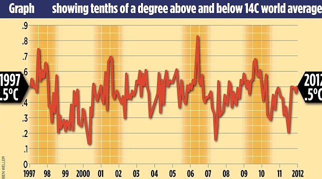
Global warming stopped 16 years ago, reveals Met Office report quietly released... and here is the chart to prove it
The figures reveal that from the beginning of 1997 until August 2012 there was no discernible rise in aggregate global temperatures
This means that the ‘pause’ in global warming has now lasted for about the same time as the previous period when temperatures rose, 1980 to 1996
https://www.dailymail.co.uk/science...-report-quietly-released--chart-prove-it.html
Please cite some refutation.Wow!
The proof chart!!
Random Internet Lunatic proof!
You're gonna hate 5G combined with the smartgrid when they get their mitts on it.Progs just use climate change as an excuse to take more liberty from us.
When arthritis sets in and you need to crank the heat up to 24C you'll need to apply for a medical exemption to use more energy.
Late for work? Good luck going 10km/h over the speed limit when you vehicle won't allow it or you'll get an instant ticket emailed to you. Fail to pay the ticket and your car will be digitally seized and immobilized.
On a hot day you won't be chilling your beer to an ideal 3C in the fridge with the AC set to 20C. Your smart appliances will limit you to the Ministry of the Environment standards.
Put up solar panels to fight the man? Guess what? They'll tax you as a producer. There will be no going off grid. Grid-tied or nothing it's illegal.
But hey, you are doing your civil duty to save the environment. It has nothing to do with control. It's for your new godess the Earth.
This one's got charts, too!Please cite some refutation.
http://skepticalscience.com/
It also talks about the pathology of climate change denial.

Only if they are accurate and not tinkered with. Are they accurate and unadulterated?Charts mean real science!
Anybody even seen a chart that shows how much gravity bends light? No, and you never woll for giid reason. That is the cornerstone of modern science btw.
This a drawing, like an animation it is not science, it is art.

This a drawing, like an animation it is not science, it is art.
That's a diagram.
di·a·gram
/ˈdīəˌɡram/
Learn to pronounce
noun
1.
a simplified drawing showing the appearance, structure, or workings of something; a schematic representation.
"a diagram of the living room"
synonyms: drawing, line drawing, illustration, picture, artist's impression; More
verb
1.
represent (something) in graphic form.
"the experiment is diagramed on page fourteen"
The one thing you did clearly show is that there is no end to the trolling the loco collective does here.That's a diagram.
di·a·gram
/ˈdīəˌɡram/
Learn to pronounce
noun
1.
a simplified drawing showing the appearance, structure, or workings of something; a schematic representation.
"a diagram of the living room"
synonyms: drawing, line drawing, illustration, picture, artist's impression; More
verb
1.
represent (something) in graphic form.
"the experiment is diagramed on page fourteen"
https://study.com/academy/lesson/how-to-read-scientific-graphs-charts.html
How to Read Scientific Graphs & Charts
How do scientists summarize their findings with visual aids? In this lesson, explore the different types of tables, charts and graphs that scientists use. Learn to read these effectively as a preview to your science studies.
Representation of Scientific Work
The scientific method is a set of procedures that scientists use to learn about the world. Scientists generally follow this method, but they also compete and collaborate on their work in order to reach a consensus within the scientific community. Sometimes, a scientist's work can take years to complete, but s/he still has to communicate his/her ideas to others. How do scientists summarize their findings so that other scientists can understand it in a matter of minutes? The answer is in the tables, graphs and charts that illustrate their data. In this lesson, we'll look at the basic types of charts and learn how to read them effectively.
Data in Tables & Line Graphs
Line graphs are used to depict the relationship between dependent and independent variables.

The two variables that you're recording are different, in that one variable is dependent upon the other. Since the height of the plant changes due to the passage of time, we say that height is dependent on time. So in this case, height is called the dependent variable. A dependent variable is the factor being measured in an experiment, which changes in response to the independent variable. The factor that's not dependent on anything is time. That is, nothing is going to change how time elapses during the experiment. Therefore, we call time the independent variable. It is the factor that is considered to be constant during an experiment, which affects the dependent variable. In tables, the independent variable is usually listed in the first column and the dependent variable is listed to the right.
But remember, you'll need to add a third column to collect your data about the daisy. Every day, you'll make two measurements: one of the height of the sunflower plant and one of the height of the daisy plant. So you should be filling up one row for every day in your experiment. By the time the experiment's done, your table should be full of useful data.
This table is a great way to keep your data organized. But it's not so easy to draw any conclusions by taking a quick glance. A better way to look at this information would be to transform it into a line graph. A line graph depicts the relationship between the dependent and independent variables. Each variable is plotted along one of the two axes in the graph. The x-axis is the horizontal axis, which usually plots the independent variable. Since your independent variable is time, then you'd plot time in days along the x-axis. The other axis is called the y-axis. This is the vertical axis that usually plots the dependent variable. So your dependent variable is plant height. You're actually going to have two lines on the graph: one to show the growth of the sunflower plant, and one to show the growth of the daisy. Let's make the sunflower line orange and the daisy line blue. You'll need to add a key to the bottom to show which line describes the growth of which plant.
As you're transferring your data, you'll need to be sure to plot all the numbers correctly. The first measurement for the sunflower says that it was half a centimeter tall on the first day. So you'd find the first day on the x-axis, and draw a dot that lines up with '0.5 centimeters' on the y-axis. You'd continue the same way for all of your data in the second column. Then, to plot the growth of the daisy, you'd use the data from the third column and draw the line in blue.
Bar charts compare amounts of something between unrelated groups.

Creating a graph is pretty simple, but interpreting it can be tricky. Looking at our graph of plant growth rates, what kind of conclusions can we make? Well, we can easily see that the sunflower grew faster than the daisy on average. It reached a greater height in the first nine days, and it sprouted a full day ahead of the daisy. By comparing the slope of the lines at separate intervals, we can also see that the sunflower had the highest peak growth rate. In other words, the highest growth speed in the sunflower was greater than that of the daisy.