For football fans, pre-season (i.e. now) is the worst time of the year (except if the year ends in an even digit).
No football for weeks and weeks! Soon fans will be getting withdrawal symptoms.
But one of the few good things about pre-season is the fact that we can look forward to when next season's fixtures are out - and the new kits that teams will be wearing next season.
Everton and Manchester United have gone retro. Everton's new home shirt for next season looks similar to the one they wore in the Eighties.
But Manchester United beat their pants off when it comes to retro (if the pictures are genuine). Their new home shirt AND their new away shirt have a large "V" on them, very similar to the ones they wore in the first decades of the 20th Century.
Aston Villa go for a simple white design for their new away kit, while Chelsea's new home kit looks like something out of Robocop.
Meanwhile, Scottish team Glasgow Celtic have decided that their new away kit will have tartan shorts (a couple of seasons from now and they'll probably be wearing skirts).
Premier League kit parade: Everton's Eighties echo joins new Spurs, West Ham, Villa, Arsenal, Celtic, Chelsea, Newcastle, Liverpool, United and Man City shirts on shelves
By Laura Williamson, Matt Sandy and Ashley Gray
10th June 2009
Daily Mail
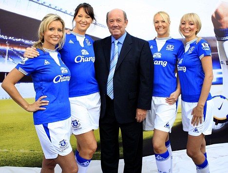
How do you sell a kit in the credit crunch? Why not ditch the designers and revive a 25-year-old strip, then sell it by a dressing a line-up of lovelies (and Howard Kendall) in the new colours?
This appears to be the strategy of Everton, who - a week or so after losing the FA Cup final - have unveiled a new home top that echoes their glory years of the mid-Eighties.
They're one of a host of Barclays Premier League clubs to launch a new kit for next season, with Sportsmail bringing you the best and worst of official shirts and potentially dodgy website leaks.

Howard's way: Goodison Park legend Kendall enjoys the launch of the new Everton kit
Tottenham Hotspur fans may be hoping the white, black and gold effort we picture below is a hoax. West Ham's new away top is out - and this one definitely is genuine.
It comes hot on the heels of Aston Villa's England-style away shirt. Rather than just revealing another run-of-the-mill white away strip, they have contrived to produce a 'special' white strip that celebrates Aston Villa's England connection after the club reached that magic number of Three Lions internationals - 67.

England inspired: Gareth Barry wears the new Aston Villa away shirt
Still, maybe it was never a great idea to dress Gareth Barry in it for the promotional shots.
Arsenal have unveiled their away kit for next season and the Gunners will be out to give their Premier League rivals the blues. Midnight blue with a white pin-strip to be precise.
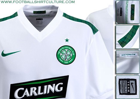
Celtic have a new away kit sure to make many a Scotsman proud - and anyone with a modicum of taste hurl.
The white shirt is accompanied by eye-catching green shorts complete with a fetching tartan pattern.
Newcastle have given fans a look at their new home strip for next season, which would look dashing on any Coca-Cola Championship player.
The official pictures follow months of leaks, which included the rather disappointing moment when Chelsea's weird panel-design home shirt turned out to be more than an internet viral.
A quick trawl of the internet has revealed some leaked pictures of some very suspect kits - and only Liverpool come out unscathed in the style stakes.
If the images are to be believed, Manchester United will be playing in a peasant-style lace up number in 2009-10.
Manchester City, the nouveau riche pretenders to the crown, appear to have ditched their pale, sky blue shirts - reminiscent of the Lancashire sky - in favour of an Abu Dhabi inspired brighter shade.
Here is Sportsmail's run-down of the shirts the big boys will (or could) be sporting next season.
Arsenal

The Gunners' red home shirt will last another season but their yellow away strip has been replaced with this less-than-jazzy number as modelled by Theo Walcott.
Trinny & Susannah rating (as imagined by Sportsmail):
6/10. Safe and unspectacular but a bit too much like something you would see on a golf course. Ideal for team bonding sessions over 18 holes.
Still, it could have been worse...

How it looked: Arsenal in 1982
Aston Villa

Playing safe: Villa can't really go wrong with a plain white away strip
It's not just a marketing gimmick, honest. This shirt celebrates Villa's 67 England internationals by being not just white, but 'football white'. It has a 'Villan red' trim, 'midnight navy' shorts and - rather disappointingly - ordinary white socks.
And here's the science bit: 'The kit is made from Nike Dri-Fit, an innovative technology that enhances the performances of players by keeping them drier, cooler and lighter. It achieves this by drawing sweat away from the body to the fabric's surface for fast drying, while its three-dimensional construction allows for more air space around the skin to reduce clinging.'
Trinny & Susannah rating (as imagined by Sportsmail):
6/10. Little to shock or disgust, this white strip plays it pretty safe. Even the stripes are understated. Likely to be instantly forgettable.
Celtic

Tartan delight: Celtic's new away shirt

Celtic stick with their traditional green and white for the latest away kit. Why would you do anything else?
But the kit gets a twist with an interesting green tartan trim.
The green star above the badge, celebrating the Lisbon Lions' achievement as Britain's first winners' of the European Cup, is more than enough in the way of finishing off the stip.
Trinny & Susannah rating:
4/10. Nice clean white shirt, which unfortunately won't look to good with a few pints tipped down the front. Nevertheless tidy, but spoled by some of the most disgusting shorts ever put in front of human eyes.
Chelsea

I'll be back: Chelsea appear to have turned to Arnie for their new kit
Hmmm...does Didier Drogba really need any more excuse to emphasise his muscular physique? The new Chelsea home shirt is embellished with what appear to be 'pec panels', sort of Robocop meets Gladiator sections in the chest area. And a zip, which will make the customary dab of Vicks a little difficult to place.
Trinny & Susannah rating:
5/10. Trying too hard is guaranteed failure on the catwalk, sorry, football pitch.
Everton


Blue beauty: Leon Osman (bottom) in a shirt that bears more than a little resemblance to the kit of the 1985 League winners, modelled by Andy Gray (top)
Everyone likes a retro kit, except when it's that salmon and navy effort that Everton plumped for a few years ago. After what will be 15 years without a trophy, the blue half of Liverpool have decided to remind themselves of a more glorious era with a kit that echoes 1983-85, when Everton won the League, FA Cup, League Cup and Cup-Winners' Cup. That's a lot to live up to.
Trinny & Susannah rating:
6/10. Take a classic kit and then spoil it a bit with the exaggerated white triangle around the neck. What's that all about? It looks like the a handkerchief around ready to show up a plethora of beer and ketchup stains. Genius. Looks good on the girls though.
Liverpool

Got it right: Liverpool's new away kit is leading the fashion stakes
Another potential pearler from shirt manufacturers Adidas as Liverpool swap their grey away kit for a swish black number with gold features and red piping. A little like last season's European kit, this black number is sure to be popular with Liverpool fans.
Trinny & Susannah rating:
8/10. 'Pure class', as Stevie G would say.
Manchester City

Blue is the colour: Apparently the new Manchester City home shirt
The usual sky blue, if the shade is a little more eye-catching (which City hope to be next season), with white on the top of the sleeves.
The Etihad Airways logo, appropriately enough the national airline of the United Arab Emirates, is arguably a classier replacement for package holiday company Thomas Cook across the centre of the jersey, while the badge is in traditional position across the left breast after a stint in the middle.
Trinny & Susannah rating:
7/10. Interesting navy bars down the side of the shirt, but it works, somehow.
Manchester United

Surely not: Manchester United could be wearing this at Old Trafford next year
Home: I would pay cold, hard cash to see Cristiano Ronaldo trot out of the Old Trafford tunnel is this special ensemble. The potential home kit, admittedly, is better than the monstrous away version (see below, just you wait), but the retro V-neck, particularly the additional white triangle, is still pretty naff. Please, please, let this be Manchester United's home kit next season....
Trinny & Susannah rating:
4/10. Champions of Europe? You won't be champions of your own back yard in this boring design.

Fashion faux pas: Manchester United's proposed away kit is awful
Away: Isn't this truly wonderful? Wonderful as in the 'I-wouldn't-be-seen-dead-wearing-that' way.
The silky white Grandad-style collar with a ridiculous lace up design, the plunging V-neck, the sheer bagginess of the whole thing - Wayne Rooney would look an absolute beauty in this baby. Coleen would not be amused.
Trinny & Susannah rating:
1/10. Awful. Just awful. A charity shop special.
Newcastle United

Old faithful: The Newcastle strip doesn't exactly change much
There seem to be few design dilemmas when it comes to the Newcastle shirt: badge in the middle or not? Thick stripes or thin? Collar or not?
The most controversial decision seems to be a big white panel on the back where a number should go, reminiscent of a big white flag.
Trinny & Susannah rating:
7/10. The white round collar looks a bit naff, but you can't really go wrong with black and white stripes, unless you're Mike Ashley.
Tottenham Hotspur

Not all white: Is this Tottenham's new home shirt?
Is this the kit of a team who are about to break into the Big Four? Whichever way you look at it, the answer is no.
The shirt, doing the rounds on the internet, has a rather odd gold V around the collar, at least three visible Puma logos and rather intrusive black panels that are preferred to the more in vogue navy blue of recent years.
Trinny & Susannah rating:
2/10. Is it retro, is it ultra-modern? No, it's just plain awful.
West Ham United
Enlarge Feeling blue: West Ham United's two-tone blue away shirt
No more white, or loud sky blue, West Ham have unveiled something a little more serious - a two-tone blue away strip that looks set to be popular at Upton Park.
And it comes with the option of promoting the Bobby Moore Fund on the front rather than SBOBET.com, just in case this sponsor goes the way of the last.
Trinny & Susannah rating:
7/10. Not sure about the collar, but the colours go together well while maintaining a certain tradition. Nice white trim finishes it off.
dailymail.co.uk
No football for weeks and weeks! Soon fans will be getting withdrawal symptoms.
But one of the few good things about pre-season is the fact that we can look forward to when next season's fixtures are out - and the new kits that teams will be wearing next season.
Everton and Manchester United have gone retro. Everton's new home shirt for next season looks similar to the one they wore in the Eighties.
But Manchester United beat their pants off when it comes to retro (if the pictures are genuine). Their new home shirt AND their new away shirt have a large "V" on them, very similar to the ones they wore in the first decades of the 20th Century.
Aston Villa go for a simple white design for their new away kit, while Chelsea's new home kit looks like something out of Robocop.
Meanwhile, Scottish team Glasgow Celtic have decided that their new away kit will have tartan shorts (a couple of seasons from now and they'll probably be wearing skirts).
Premier League kit parade: Everton's Eighties echo joins new Spurs, West Ham, Villa, Arsenal, Celtic, Chelsea, Newcastle, Liverpool, United and Man City shirts on shelves
By Laura Williamson, Matt Sandy and Ashley Gray
10th June 2009
Daily Mail
How do you sell a kit in the credit crunch? Why not ditch the designers and revive a 25-year-old strip, then sell it by a dressing a line-up of lovelies (and Howard Kendall) in the new colours?
This appears to be the strategy of Everton, who - a week or so after losing the FA Cup final - have unveiled a new home top that echoes their glory years of the mid-Eighties.
They're one of a host of Barclays Premier League clubs to launch a new kit for next season, with Sportsmail bringing you the best and worst of official shirts and potentially dodgy website leaks.

Howard's way: Goodison Park legend Kendall enjoys the launch of the new Everton kit
Tottenham Hotspur fans may be hoping the white, black and gold effort we picture below is a hoax. West Ham's new away top is out - and this one definitely is genuine.
It comes hot on the heels of Aston Villa's England-style away shirt. Rather than just revealing another run-of-the-mill white away strip, they have contrived to produce a 'special' white strip that celebrates Aston Villa's England connection after the club reached that magic number of Three Lions internationals - 67.

England inspired: Gareth Barry wears the new Aston Villa away shirt
Still, maybe it was never a great idea to dress Gareth Barry in it for the promotional shots.
Arsenal have unveiled their away kit for next season and the Gunners will be out to give their Premier League rivals the blues. Midnight blue with a white pin-strip to be precise.
Celtic have a new away kit sure to make many a Scotsman proud - and anyone with a modicum of taste hurl.
The white shirt is accompanied by eye-catching green shorts complete with a fetching tartan pattern.
Newcastle have given fans a look at their new home strip for next season, which would look dashing on any Coca-Cola Championship player.
The official pictures follow months of leaks, which included the rather disappointing moment when Chelsea's weird panel-design home shirt turned out to be more than an internet viral.
A quick trawl of the internet has revealed some leaked pictures of some very suspect kits - and only Liverpool come out unscathed in the style stakes.
If the images are to be believed, Manchester United will be playing in a peasant-style lace up number in 2009-10.
Manchester City, the nouveau riche pretenders to the crown, appear to have ditched their pale, sky blue shirts - reminiscent of the Lancashire sky - in favour of an Abu Dhabi inspired brighter shade.
Here is Sportsmail's run-down of the shirts the big boys will (or could) be sporting next season.
Arsenal

The Gunners' red home shirt will last another season but their yellow away strip has been replaced with this less-than-jazzy number as modelled by Theo Walcott.
Trinny & Susannah rating (as imagined by Sportsmail):
6/10. Safe and unspectacular but a bit too much like something you would see on a golf course. Ideal for team bonding sessions over 18 holes.
Still, it could have been worse...

How it looked: Arsenal in 1982
Aston Villa

Playing safe: Villa can't really go wrong with a plain white away strip
It's not just a marketing gimmick, honest. This shirt celebrates Villa's 67 England internationals by being not just white, but 'football white'. It has a 'Villan red' trim, 'midnight navy' shorts and - rather disappointingly - ordinary white socks.
And here's the science bit: 'The kit is made from Nike Dri-Fit, an innovative technology that enhances the performances of players by keeping them drier, cooler and lighter. It achieves this by drawing sweat away from the body to the fabric's surface for fast drying, while its three-dimensional construction allows for more air space around the skin to reduce clinging.'
Trinny & Susannah rating (as imagined by Sportsmail):
6/10. Little to shock or disgust, this white strip plays it pretty safe. Even the stripes are understated. Likely to be instantly forgettable.
Celtic

Tartan delight: Celtic's new away shirt

Celtic stick with their traditional green and white for the latest away kit. Why would you do anything else?
But the kit gets a twist with an interesting green tartan trim.
The green star above the badge, celebrating the Lisbon Lions' achievement as Britain's first winners' of the European Cup, is more than enough in the way of finishing off the stip.
Trinny & Susannah rating:
4/10. Nice clean white shirt, which unfortunately won't look to good with a few pints tipped down the front. Nevertheless tidy, but spoled by some of the most disgusting shorts ever put in front of human eyes.
Chelsea

I'll be back: Chelsea appear to have turned to Arnie for their new kit
Hmmm...does Didier Drogba really need any more excuse to emphasise his muscular physique? The new Chelsea home shirt is embellished with what appear to be 'pec panels', sort of Robocop meets Gladiator sections in the chest area. And a zip, which will make the customary dab of Vicks a little difficult to place.
Trinny & Susannah rating:
5/10. Trying too hard is guaranteed failure on the catwalk, sorry, football pitch.
Everton


Blue beauty: Leon Osman (bottom) in a shirt that bears more than a little resemblance to the kit of the 1985 League winners, modelled by Andy Gray (top)
Everyone likes a retro kit, except when it's that salmon and navy effort that Everton plumped for a few years ago. After what will be 15 years without a trophy, the blue half of Liverpool have decided to remind themselves of a more glorious era with a kit that echoes 1983-85, when Everton won the League, FA Cup, League Cup and Cup-Winners' Cup. That's a lot to live up to.
Trinny & Susannah rating:
6/10. Take a classic kit and then spoil it a bit with the exaggerated white triangle around the neck. What's that all about? It looks like the a handkerchief around ready to show up a plethora of beer and ketchup stains. Genius. Looks good on the girls though.
Liverpool

Got it right: Liverpool's new away kit is leading the fashion stakes
Another potential pearler from shirt manufacturers Adidas as Liverpool swap their grey away kit for a swish black number with gold features and red piping. A little like last season's European kit, this black number is sure to be popular with Liverpool fans.
Trinny & Susannah rating:
8/10. 'Pure class', as Stevie G would say.
Manchester City

Blue is the colour: Apparently the new Manchester City home shirt
The usual sky blue, if the shade is a little more eye-catching (which City hope to be next season), with white on the top of the sleeves.
The Etihad Airways logo, appropriately enough the national airline of the United Arab Emirates, is arguably a classier replacement for package holiday company Thomas Cook across the centre of the jersey, while the badge is in traditional position across the left breast after a stint in the middle.
Trinny & Susannah rating:
7/10. Interesting navy bars down the side of the shirt, but it works, somehow.
Manchester United

Surely not: Manchester United could be wearing this at Old Trafford next year
Home: I would pay cold, hard cash to see Cristiano Ronaldo trot out of the Old Trafford tunnel is this special ensemble. The potential home kit, admittedly, is better than the monstrous away version (see below, just you wait), but the retro V-neck, particularly the additional white triangle, is still pretty naff. Please, please, let this be Manchester United's home kit next season....
Trinny & Susannah rating:
4/10. Champions of Europe? You won't be champions of your own back yard in this boring design.

Fashion faux pas: Manchester United's proposed away kit is awful
Away: Isn't this truly wonderful? Wonderful as in the 'I-wouldn't-be-seen-dead-wearing-that' way.
The silky white Grandad-style collar with a ridiculous lace up design, the plunging V-neck, the sheer bagginess of the whole thing - Wayne Rooney would look an absolute beauty in this baby. Coleen would not be amused.
Trinny & Susannah rating:
1/10. Awful. Just awful. A charity shop special.
Newcastle United

Old faithful: The Newcastle strip doesn't exactly change much
There seem to be few design dilemmas when it comes to the Newcastle shirt: badge in the middle or not? Thick stripes or thin? Collar or not?
The most controversial decision seems to be a big white panel on the back where a number should go, reminiscent of a big white flag.
Trinny & Susannah rating:
7/10. The white round collar looks a bit naff, but you can't really go wrong with black and white stripes, unless you're Mike Ashley.
Tottenham Hotspur

Not all white: Is this Tottenham's new home shirt?
Is this the kit of a team who are about to break into the Big Four? Whichever way you look at it, the answer is no.
The shirt, doing the rounds on the internet, has a rather odd gold V around the collar, at least three visible Puma logos and rather intrusive black panels that are preferred to the more in vogue navy blue of recent years.
Trinny & Susannah rating:
2/10. Is it retro, is it ultra-modern? No, it's just plain awful.
West Ham United
Enlarge
 Feeling blue: West Ham United's two-tone blue away shirt
No more white, or loud sky blue, West Ham have unveiled something a little more serious - a two-tone blue away strip that looks set to be popular at Upton Park.
And it comes with the option of promoting the Bobby Moore Fund on the front rather than SBOBET.com, just in case this sponsor goes the way of the last.
Trinny & Susannah rating:
7/10. Not sure about the collar, but the colours go together well while maintaining a certain tradition. Nice white trim finishes it off.
dailymail.co.uk
Last edited: